Monday, 20 December 2010

Evaluation Q4


Friday, 17 December 2010

Evaluation Q1

Our product challenges many forms of conventions in films as firstly, we used a small girl in our film. This goes against the existing conventions of a film trailer as they usually have a male adult antagonist, This means that the audience will feel something for the antagonist origionally at the start of the film, but eventually be scared of her as she is changed from the sweet, young girl into a killer. we also used a real weapon as the few other films that include young girls as the antagonist are supernatural and use supernatural killing methods such as "The Ring"'s soul-suck to kill her victims. (Post about the Characters)

The magazine uses all of the usual magazine conventions that we found in film magazines, such as empire and Total Film. The conventions in our magaizne were largly unchanged from these usual conventions found in these giants, we decided that changing the conventions would ward off the audience as they would not feel comfortable feeling a new magazine, than pick up a new one.

Our media can be used to challenge forms and conventions of real media products as the main antagonist in our film is the young innocent girl that you see at the start of the trailer. You give a huge amount of sympathy to her because she is killed in the trailer and you also have many shots of her in advertising looking innocent. She is then portrayed through the end of the trailer as evil. This shocks the audience as there is no protagonist in our trailer. This is challenging the conventions of the horror genre and real media products as they usually have a set antagonist, protagonist and victims. Our product has no protagonist so evil is winning; this is different to the other existing media.

· The media products use the form of the horror genre as the trailer uses chilling music and sound effect to get the atmosphere correct.

Evaluation Q2..

Our film campaign was very effective in the way that it reached our audience. We used many film distributions and ways to advertise our film, such as facebook and youtube. These sites allowed us to upload our trailer to them and distrubute them freely and fast among the internet.


Our trailer was aimed at an audience of 15+, this was a perfect age range as at this age you start to get interested in scary films and going out with friends to see them, this teamed with the facebook campaign saw the trailer and film take off as the viral campaign worked very well. We needed to find out mroe about our target audience so i decided to make a moodboard by asking my friends what they were interested in at this age, this was very useful as i had many people to draw information from.


We used Facebook to make a page about the film campaign which was to be used as a word-of-mouth style advertisement, this helped because of the nature of facebook as you can see what your friends are looking at and check them out for yourself developing a chain reaction. This is a very good way to access the films information as the page would have all the information and photos of shooting and the film poster and information about the actors. This was a very good way for me of distribution as my friends are avid facebook-ers so they naturally jumped on the opportunity to be apart of something like this from the comfort of thier own computer.

Facebook

The trailer only had few shots of the protagonist, this created a sense of mystery and enigma between the audience as they did not have much of a taste of her, but wanted to find out more about the girl. The format that the film trailer was uploaded in had a comment function which allowed everyone to comment and discuss the trailer on the page and share thier thoughts and opinions on the trailer, this was intentional as we wanted the trailer to be controvertial in a way that people will talk about it and want to find out more.

Film Trailer

In the film poster, you need to have the main character plainly visible and eye catching, this allows the audience to see the girl and be drawn in to her. This is a very good way for the poster to be seen as it would stand out among other posters. All the colours in the film poster reflect the dark nature of this film, using the dark green i made the film poster look very evil. The way the font was styled made it look like it was splattered or painted with a loose brush, this gives it a bloody effect that was perfect for a our slasher-esque film trailer. The film poster drifts away sliughtly from the classic film posters of the past so we could appeal to our target audience by embracing the new types of horror films on nowadays.

Film Poster

A film magazine is a piece of text that is used to display the film in a way that would be appealing to an audience of many films. I believe our magazine achieves just that as it shows that it is a horror film but also, displays a film that is very modern and appealing to the audience. The location where the picture was taken was at the moment that she kills the man in the forest, this is because it was not clear to see her, or her face. Giving the woman a mysterious and scary atmosphere around her. The magazine also has all of the conventions that a normal magazine should have such as a title, tag-line, price and other articles in the film. the magazine also has behind the scenes shots that i took to give even more information on the film and really push it out.


Tuesday, 14 December 2010

Evaluation Q3


The film campaign was created a film campaign facebook page dedicated to it to give audiences information and regular updates about the film through a medium that they are already exposed to. Whenever the page is updated or something is posted on it, the post goes into their personal new feed where they can see it. Facebook is a very popular social networking site th

at has millions of active users. This was a wise move putting the film campaign on a page there so it can receive the fans it wants as you only have to search the name to find it, or it can be shared through viral messaging fast through statuses and news feed links.

The comments on the video are to give me a good perspective of an outside point of view of my film. Below are some of the comments that were posted on the film video.

Reda said that it would be a good idea to use echoes on the narrators voice which could have made the trailer seem more dramatic like current voice overs. This could be a possibility but it also could make the trailer seem "over-the-top" and add an element of parody comedy which would completely ruin the atmosphere.

The recurring problem with the comments and our film according to audience feedback is that our film trailer was bad quality and that it should have been filmed with a better camera or just uploaded or rendered in a better way. This is problem to do with witht eh filming or the rendering. fit was the filming we just needed to use a better quality camera with a higher pixel count. If it was the rendering, then we would have had to use a different file type to upload.


Both people that replied to my video were exactly what was described in my target audience. This is a success as my trailer is attracting the correct target audience.

Target Audience Profile

New magazine.


This is the new magazine front cover, we used a different picture in it to add more of a striking pose to the poster. This means that the audience's eyes will be drawn to it even further.

The magazine also displays the behind the scenes shots of the filming, this shows the audience that there is more about this film in this issue of the magazine, drawing them in further.

The magazine also has the usual conventions of a magazine, Price, Barcode, taglines and other articles in the magazine.

The photograph used is of the girl infront of the title portraying that she is bigger than the magazine itself giving the film more status that the magazine itself.

Moodboard

Below is a moodboard for our target audience of out film "Blackwood Forest". It is a quick reference to what the target audiences intrests are and what they are like. This tool will be invaluable for us as we will need to attempt to appeal to as many intrests they have.


Target audience profile.

The target audience of the film campaign is young adults to twenties in an age range. This is a perfect age range for out film as the film would have a certificate rating of 18 where the audience would have to me of a certain age to see it because of the violence in the film.

The audience are fans of horror, the horror genre has a huge fanbase that are most avid film-goers. This means that I can capitalize on this and try to achieve as much exposure to the film as possible, gaining fans and a following like other big horror films have.

Films like the friday the 13th franchise have a huge cult following that will go to see every other film that has him starring or related to it. This is the type of audience that we want to have and find as any sequels and merchandise to do with the film would have a ready audience and market for it.

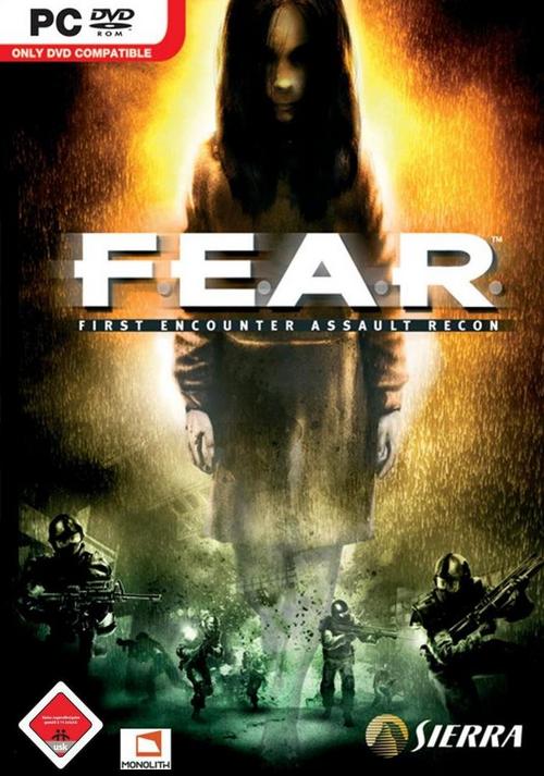
The target audience would be Late teen to late twenties, a good educational background as they would need to have a bit of intelligence to understand the plot and story of the film. The little girls character could also attract parents as to see children in a different light as the films would be incredibly scary for them. The little girl aspect of our film also has a following as there are already many films and even videogames that are of the horror genre and have this aspect, examples of this are The Ring films, Orphan and the video-game F.E.A.R. This is a brilliant fanbase that has already been established, so all we need to do is appeal to them.

Facebook post


I have posted the trailer to facebook for two reasons, Firstly, there is a huge userbase from facebook and it is easy to post and share videos, websites and pictures on that website, so it was a very good idea for me to put it on facebook. The video was converted into a format that could be uploaded to youtube, and youtube has a large userbase aswell so this would get a big audience. The second reason is that there is a comment fuction on facebook that i can take advatage of as i need to recieve feedback from this video to help me improve it.


Production details

The filmworks logo had to be prestigious and serious as it is the logo for the production company. We decided to go for a simple yet striking design on the film production text. The simple style of the title makes the audience know that it is a big company that has established itself and does not need to promote itself through other means.
This is the new colour and of the film title. This goes away from the white and supernatural look of the previous title. The green is effective as it has a disgusting feel to it as you can relate it to disgusting things like snot ect. This is what we wanted to go for in the title. You can also relate it to a forest because it is green.

the first draft of the trailer

Magazine front cover


Our first magazine had the usual conventions of ta magazine should have. The main character in the centre of the magazine to draw attention to it. A eye catching title, and other stories and articles for the reader. We need to change the front cover to a more eye catching picture because the previous picture does not have enough scare factor or eye-catching as other pictures so we need to change that.


Film posters like this are very eye-catching as they have the main character and article of the magazine in a single image that is very striking to look at. This draws the audiences eye to it as the figure on the front cover is towering.


Sound research


When we got our film trailer in the correct order and how we wanted it to look, we needed to add sound effect to finish the full atmosphere of it. We needed to look at certain sounds for certain moments in the trailer to fully get the desired effect on the audience. The sounds used needed to not be copyrighted so the trailer and the film company would not get sued by the owning companys of the sound effects.

There were many site that offered what we wanted but many of those sites were asking for money. We did not have the funds to purchase these so we needed to look for free, non-copyrighted material we could use for our trailer.

We decided on using a website that offered the sounds we needed and also had a search engine to find our sounds that we needed.

Shot list

http://www.flickr.com/photos/55771114@N07/5166078463/

A shot list is a record or preview of the shots in a certain film. Shot lists help the film crew get the exact shots they want so they dont waste filming time. In each shot there was a description to go with it so we knew what we were looking for.


The film campaign was created a film campaign facebook page dedicated to it to give audiences information and regular updates about the film through a medium that they are already exposed to. Whenever the page is updated or something is posted on it, the post goes into their personal new feed where they can see it. Facebook is a very popular social networking site that has millions of active users. This was a wise move putting the film campaign on a page there so it can receive the fans it wants as you only have to search the name to find it, or it can be shared through viral messaging fast through statuses and news feed links.

Th

e comments on the video are to give me a good perspective of an outside point of view of my film. Below are some of the comments that were posted on the film video.


Monday, 13 December 2010

Final Trailer


This is the final cut of my trailer. this is what we felt was the best we could offer to our audience and it is exactly what they need to see to be attracted to the film.

Wednesday, 8 December 2010

Magazine.


This is my magazine that i have created for the horror film campaign. This is a film magazine that focuses on films and more specifically, British films.


Stills 2

This next photo i have realised there was people not intended to be in the picture in the background and it is too late to change this, i have created some cut-outs of the main character from a picture i took of the costumes and continuity shots i took. and now going to transfer them onto another picture of a forest. This should give me some freedom in how i am going to go about this.


This particular image is perfect for the magazine cover as it has much room on the side to manipulate the text ontop of the image.


Stills

Here I have taken some stills for my Magazine and Film Poster, I do not like how the final form of them how they look so i will make adjustments to how they look using adobe photoshop to make them more appealing and more fitting to our genre of horror.


I decided that the girl looks too small for the poster so I decided to edit her so she is much bigger in the picture, looking more menacing and also becoming more of an icon in the picture. Drawing your eye to her as she is so big.

After this, i decided that she was not looking supernatural enough to really portray the sub-genre of supernatural horror we were going for, so i decided to add a negative effect on this.


I think this is the effect that really fits what i wanted to do with the pictures.
i could have used a black and white negative effect to make it even better so i will do that now. to see how it will come out.
The black and white effect i have used on the negative picture is exactly what i wanted for the Film poster. the black and white looks very spooky and makes the audience look at her.


I shall use a different picture but with the same effects for the Magazine cover as i will need to edit the girl in a different place to fit the other aspects of a magazine into them.

Tuesday, 7 December 2010

Filming.

Our trailer was filmed on two separate dates, one being on the 10th of November where we shot the house section of our trailer. This was shot at Michael Cooke's (Team Member) home. This was a perfect location as it was a good, well furnished house that fitted the synopsis well. we shot in the evening to create a sense of mystery and fear as it was dark and gloomy, so that shows in our trailer as the location has very limited visibility further than the focus. We had the props ready at the house beforehand so we did not need to bring anything with us on our travels. The day was also very cold so we had to keep warm otherwise we could risk illness.

Title.

The title design that we have decided to use for our film is a font that we found from the font website DaFont. This website has tons of fonts that are free to use, so this website was a very good resource for us.

We tested out many different fonts in many styles using the websites tool to see your own text with the many fonts on the website, this made it very easy to choose a design that appealed to us and out audience.

We decided on using a scary font that was also easy to read. This font uses a splatter effect on it that looks almost like blood, portraying evil or danger.


Photoshop

I have learned a great deal about the film campaign industry and the technology used, this is because I had to use many different types of programs and software in my film but I also had to use the hardware, e.g. camcorders and digital cameras. I knew how to use the cameras and digital cameras in the hardware so I had no problems with using them. I did have a difficulty with doing the film editing, as I did not feel comfortable and have the experience with working with the iMovie. To counter balance this, we had a person in our team that used the software before. This is very useful because the person that had the experience assisted the group to the best of his ability to edit the film.

We used the programs Photoshop also, to edit the film poster and magazine cover. This is used for the technical part of the film production, the failure of the iMovie is that the part of the film trailer, the production detail was having problems being displayed properly, this was hard to overcome but in the end we had to switch to a new editing software in order to add the production detail to a better look and feel. I think that this was a good idea as the program used was very easy to use and pick up and helped us with the editing and overall final edit of the trailer.


Tuesday, 30 November 2010

Plot Synopsis

Lucy Bower is a young innocent girl on her autumn holiday from school and is enjoying herself however every evening when the sun sets her body is taken over by an evil spirit; no one understood what it was. Her father has had enough of people talking behind his back about his daughters. One night her Father comes home from work drunk, he beings to torment her and accusing her of being evil and ends up killing her. After realising what he has done he drags the body of his daughter in to Blackwood Forest and she is never seen again.She was once an innocent little girl who was murder by her father. Her life turned upside down with abuse and pain and eventually death. However this is not the end of Lucy Bower.
Year’s later locals began to hear child-like laughter coming from the forest. People where being drawn in to the forest by the sweet childish laughter thinking a child is lost and needs help. Little did they know that the spirit of Lucy dwelt in Blackwood and swore revenge on anyone who entered Blackwood Forest where she lays? Resident’s notices that many people from the community have gone missing, locals state they last saw them last entering Blackwood Forest. Search parties where sent out to find them.

Tally marks made out from blood marks where the only thing that’s left on the tree to give the people any clues to what is happening. Blackwood Forest was abandoned by the local government and no one entered it again.
This is a story of how a little girl gets her revenge and takes out her anger on her community. You might have thought Lucy Bower was a goner, well you better think again.


Wednesday, 3 November 2010

Health and Safety

The Health and Safety on set when we film our trailer should be up to legal standards.
In our film we will be using an axe
as a weapon, so we will have to keep to the firearm regulations of HSE standards. We kept to strict guidelines as we needed to take care as the location, props
and actions of our production pose very dangerous risks. We nee
ded to plan the scenes to incredible detail so the actors would not get hurt, we are also using a child as the antagonist, so we need to take extra precaution as to her safety as she would be in the fight scenes and handling the axe.

The forest floor would also be hazardous as the child would be wearing no shoes so we would have to plan out her running route and clear away any potentially hazardous obstacles like rocks or sticks. The hunter would also have to take care of the hazards of the fight scene and being attacked by the axe, we need to make sure he is protected and does not die from the axe blow.

Wednesday, 20 October 2010

Film Titles.

The film title we have chosen to use in our production is Blackwood Forest. This name is a relation to other slasher films that have been used in the past like Eden Lake and Texas Chainsaw Massacre. These films all have the name in their title and make the film focus around a certain area.


Our film is called Blackwood Forest. We originally wen through many names such as bloodwood forest and Black-leaf wood but we then decided to settle for Blackwood Forest since it implies shadow and darkness with the 'Blackwood'. The name links back to the film Eden Forest, using the same enigma and use of the location being the film title.

Tuesday, 19 October 2010

Horror Film Characters

In organising and researching for our film campaign i have found that little girls are extremly scary. The fact they go against the conventions of a horror film is perfect for giving the audience a sense of the unknown as you usually accociate children and especially girls with innocence and happiness.


This is Samara, also known as the girl from ‘The Ring’. The Ring is a film that makes use of challenging conventions to do with little girls being scary and uses this to a great effect. She is seen in the film as extremely dangerous and also shown as incredibly scary due to firstly her face is almost always obscured by her hair. This is a form of mask as it is covering her face from the audience and gives a sense on threat. She is also seen in flashbacks throughout the film as a cut little girl. This is adding more to the sense of evil and fear as enigma is created through not knowing how she turned into such a form of evil.


This is Esther from a film called Orphan. She is portrayed origionally as a lonely orphan that has her own extraordinary talents. She is thenlater revealed to be demented and extremly evil. The main thing about this character is that she is origionally portrayed as being cute, this confuses the audience and also gives them even more fear as they origionally put faith and trust in her through her being nice.


These characters are linked to the main antagonist in our film. She is portrayed as a very young girl and has a innocent smile and laugh as if to show that she does not know the things she does are fatal and just a game to her. She is losely based on these characters as they are young girls that at some point in the film to be shown to be innocent and origionally good before the events of the film.

In the film Nightmare on Elm Street there is a male character called Freddy Krueger. He is in fact a male antagonist which is the stereotype of a horror film antagonist. He is a very recognizable character in horror films as his costume with the red and green striped jumper and hat are easily recognizable. His glove is incredible recognizable as the clawed glove has almost become a symbol for horror films in the past as it is instantly recognizable in films and has even made cameos in other films such as in the 9th Friday the 13th, the clow is seen grabbing Jason back to hell. His face is also horribly disfigured and burned. This is very scary as the audience is scared by his unnatural face. He is a stereotypical type of antagonist and does not go with out film type as we will be using a young female antagonist.

The victim of our trailer is a large man, a hiker. Hikers are generally strong and burly, he is then attacked b
y a young girl. This is going drastically agains the conventions as usually the big male character is the strong stoic type and even could be the anta
gonist.

Chip dove is in a film called Jennifer's body. This film also goes against conventions so that the
males in the film are all seen as victims as the female is the main antagonist.


Wednesday, 15 September 2010

Analyzing a trailer


The Expendables

We are told the name of the film near the end of the trailer and the most climatic part of the trailer, this gives the audience a lasting memory of the name of the film.
We are told who is starring in the film because this film has a huger cast of big action movies stars like Sylvester Stallone and Jason Statham. This m.is given to us in huge writing bursting into the screen in white on a black background for the most impacting effect. this is going with the genre of the film being a very violent and flamboyant
action film. The reason we are told who is starring int he film is because of the very large cast of massive movies stars. This would bring all the fans from each of them to see this film and also attract action movie fans as it boasts that cast.

We see a large amount of explosions and gunfights in the film so we will be seeing a large amount of gunfights, fires and explosions. This is the ground basis for a good action film, this screengrab clearly sums up most of the action in the film.
This screen grab contains the military vehicle and the rolling soldiers, on the background of the huge explosion. This is just eye candy for the audience to draw them in and give them a taste of spectacular shots like this for the film.
The soundtrack of the film is by a wellknown band of the rock genre called Shinedown. They would bring thier respected fans to watch this film. As well having thier own fanbase, the bands music would suit the films action nature perfectly with the hard rock of their music.


Concepts


The concepts of the current film our film would be a horror film. In our group work we decided to do a brainstorm or mind-map type style to put our thoughts on. This is a photograph of what we wrote. We looked at many types of horror films and compared their aspects. We concluded that there was a very fixed formula for horror films as they usually contain some sort of weapon or device used for hurting / murdering people. In Nightmare on Elm Street it is Freddy Krueger's clawed glove, which is a very scary and brutal weapon. In other films it is simple mind torture like in The Ring, Samara only uses her mind to kill people and drain their life. We also showed that the horror usually stars male antagonists such as Freddy Krueger (Nightmare on Elm Street), Jason Voorhees (Friday the 13th) or Michael Myers (Halloween). They are all strong, scary and very intimidating characters, This is a main part of having a male antagonist as there is usually a female protagonist so they seem to be weaker and an underdog in the fight. Other films challenge this stereotype of the male being the antagonist, such as The Ring. In The Ring, the antagonist is a girl called Samara who is portrayed through most of the film as a little girl but when she actually attacks during the film she is a very scary force. This switches the audience to the unfamiliar as they are used to male protagonists.

Friday, 10 September 2010

Prelim Task


This is our preliminary task where we created a short film around the simple brief of "The Meeting". We decided to do a short film about a meeting of friends that decide to go and play football. This was a simple and easy idea to carry out but we wanted it to be fast paced so the short film drew the audience in.

Some good points about the Film are as follows:
  • How we matched the shots to be very fluid and consistent with the film. E.g. when we were taking the football shot the kicks and the ball hitting the goal were perfectly matched up.
  • We also made it have a fair amount of comedy in it. This drew the audience in as we seemed like a group of friends just having fun so the audience could connect with that and make a relation to it.
If i was to improve this piece of work i would have;
  • Created a more set script so the narrative was clear and precise.
  • Made the film slightly longer. The film does not describe why the boys are where they are or how they got there. The film does also not explain the reasons of the confrontation.

Wednesday, 8 September 2010

Introduction

We have just been put into our groups for the film campaign assignment. My group is made up from Sayem, Micheal and myself. We each have a wide range of skills to complete this coursework, including creativity, ICT skills, story writing skills and experience with filming. All of these skills are going to be used to their full potential to finish in time for the deadline, 1st december 2010. We shall organize our time accurately to produce this campaign quickly and efficiently. The campagn shall include A film trailer, research and a Magazine.

Friday, 9 July 2010