Monday, 20 December 2010

Evaluation Q4


Friday, 17 December 2010

Evaluation Q1

Our product challenges many forms of conventions in films as firstly, we used a small girl in our film. This goes against the existing conventions of a film trailer as they usually have a male adult antagonist, This means that the audience will feel something for the antagonist origionally at the start of the film, but eventually be scared of her as she is changed from the sweet, young girl into a killer. we also used a real weapon as the few other films that include young girls as the antagonist are supernatural and use supernatural killing methods such as "The Ring"'s soul-suck to kill her victims. (Post about the Characters)

The magazine uses all of the usual magazine conventions that we found in film magazines, such as empire and Total Film. The conventions in our magaizne were largly unchanged from these usual conventions found in these giants, we decided that changing the conventions would ward off the audience as they would not feel comfortable feeling a new magazine, than pick up a new one.

Our media can be used to challenge forms and conventions of real media products as the main antagonist in our film is the young innocent girl that you see at the start of the trailer. You give a huge amount of sympathy to her because she is killed in the trailer and you also have many shots of her in advertising looking innocent. She is then portrayed through the end of the trailer as evil. This shocks the audience as there is no protagonist in our trailer. This is challenging the conventions of the horror genre and real media products as they usually have a set antagonist, protagonist and victims. Our product has no protagonist so evil is winning; this is different to the other existing media.

· The media products use the form of the horror genre as the trailer uses chilling music and sound effect to get the atmosphere correct.

Evaluation Q2..

Our film campaign was very effective in the way that it reached our audience. We used many film distributions and ways to advertise our film, such as facebook and youtube. These sites allowed us to upload our trailer to them and distrubute them freely and fast among the internet.


Our trailer was aimed at an audience of 15+, this was a perfect age range as at this age you start to get interested in scary films and going out with friends to see them, this teamed with the facebook campaign saw the trailer and film take off as the viral campaign worked very well. We needed to find out mroe about our target audience so i decided to make a moodboard by asking my friends what they were interested in at this age, this was very useful as i had many people to draw information from.


We used Facebook to make a page about the film campaign which was to be used as a word-of-mouth style advertisement, this helped because of the nature of facebook as you can see what your friends are looking at and check them out for yourself developing a chain reaction. This is a very good way to access the films information as the page would have all the information and photos of shooting and the film poster and information about the actors. This was a very good way for me of distribution as my friends are avid facebook-ers so they naturally jumped on the opportunity to be apart of something like this from the comfort of thier own computer.

Facebook

The trailer only had few shots of the protagonist, this created a sense of mystery and enigma between the audience as they did not have much of a taste of her, but wanted to find out more about the girl. The format that the film trailer was uploaded in had a comment function which allowed everyone to comment and discuss the trailer on the page and share thier thoughts and opinions on the trailer, this was intentional as we wanted the trailer to be controvertial in a way that people will talk about it and want to find out more.

Film Trailer

In the film poster, you need to have the main character plainly visible and eye catching, this allows the audience to see the girl and be drawn in to her. This is a very good way for the poster to be seen as it would stand out among other posters. All the colours in the film poster reflect the dark nature of this film, using the dark green i made the film poster look very evil. The way the font was styled made it look like it was splattered or painted with a loose brush, this gives it a bloody effect that was perfect for a our slasher-esque film trailer. The film poster drifts away sliughtly from the classic film posters of the past so we could appeal to our target audience by embracing the new types of horror films on nowadays.

Film Poster

A film magazine is a piece of text that is used to display the film in a way that would be appealing to an audience of many films. I believe our magazine achieves just that as it shows that it is a horror film but also, displays a film that is very modern and appealing to the audience. The location where the picture was taken was at the moment that she kills the man in the forest, this is because it was not clear to see her, or her face. Giving the woman a mysterious and scary atmosphere around her. The magazine also has all of the conventions that a normal magazine should have such as a title, tag-line, price and other articles in the film. the magazine also has behind the scenes shots that i took to give even more information on the film and really push it out.


Tuesday, 14 December 2010

Evaluation Q3


The film campaign was created a film campaign facebook page dedicated to it to give audiences information and regular updates about the film through a medium that they are already exposed to. Whenever the page is updated or something is posted on it, the post goes into their personal new feed where they can see it. Facebook is a very popular social networking site th

at has millions of active users. This was a wise move putting the film campaign on a page there so it can receive the fans it wants as you only have to search the name to find it, or it can be shared through viral messaging fast through statuses and news feed links.

The comments on the video are to give me a good perspective of an outside point of view of my film. Below are some of the comments that were posted on the film video.

Reda said that it would be a good idea to use echoes on the narrators voice which could have made the trailer seem more dramatic like current voice overs. This could be a possibility but it also could make the trailer seem "over-the-top" and add an element of parody comedy which would completely ruin the atmosphere.

The recurring problem with the comments and our film according to audience feedback is that our film trailer was bad quality and that it should have been filmed with a better camera or just uploaded or rendered in a better way. This is problem to do with witht eh filming or the rendering. fit was the filming we just needed to use a better quality camera with a higher pixel count. If it was the rendering, then we would have had to use a different file type to upload.


Both people that replied to my video were exactly what was described in my target audience. This is a success as my trailer is attracting the correct target audience.

Target Audience Profile

New magazine.


This is the new magazine front cover, we used a different picture in it to add more of a striking pose to the poster. This means that the audience's eyes will be drawn to it even further.

The magazine also displays the behind the scenes shots of the filming, this shows the audience that there is more about this film in this issue of the magazine, drawing them in further.

The magazine also has the usual conventions of a magazine, Price, Barcode, taglines and other articles in the magazine.

The photograph used is of the girl infront of the title portraying that she is bigger than the magazine itself giving the film more status that the magazine itself.

Moodboard

Below is a moodboard for our target audience of out film "Blackwood Forest". It is a quick reference to what the target audiences intrests are and what they are like. This tool will be invaluable for us as we will need to attempt to appeal to as many intrests they have.


Target audience profile.

The target audience of the film campaign is young adults to twenties in an age range. This is a perfect age range for out film as the film would have a certificate rating of 18 where the audience would have to me of a certain age to see it because of the violence in the film.

The audience are fans of horror, the horror genre has a huge fanbase that are most avid film-goers. This means that I can capitalize on this and try to achieve as much exposure to the film as possible, gaining fans and a following like other big horror films have.

Films like the friday the 13th franchise have a huge cult following that will go to see every other film that has him starring or related to it. This is the type of audience that we want to have and find as any sequels and merchandise to do with the film would have a ready audience and market for it.

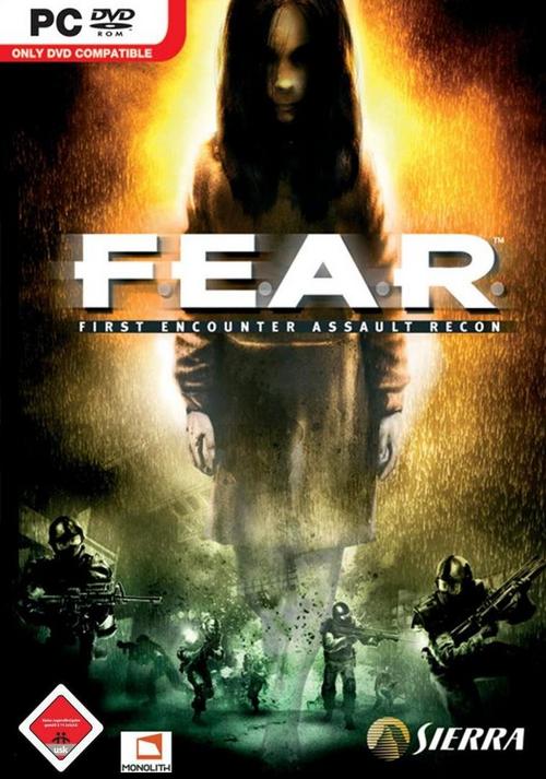
The target audience would be Late teen to late twenties, a good educational background as they would need to have a bit of intelligence to understand the plot and story of the film. The little girls character could also attract parents as to see children in a different light as the films would be incredibly scary for them. The little girl aspect of our film also has a following as there are already many films and even videogames that are of the horror genre and have this aspect, examples of this are The Ring films, Orphan and the video-game F.E.A.R. This is a brilliant fanbase that has already been established, so all we need to do is appeal to them.